Designing a Clearer Path to Purchase
Marketing, Sales Design, Product CRO, Engineering

Overview
“The pricing page isn’t just about listing plans—it’s where users decide if our product is right for them. Clarity here is everything.”
The FreshBooks pricing page is one of the most critical points in the customer journey—where users evaluate plans, compare features, and decide whether to purchase or start a free trial. However, the existing page was outdated, cluttered, and misaligned with FreshBooks’ updated brand. It was also difficult to scan and compare plans, which created friction and hurt conversion. The goal was to redesign the pricing page to improve clarity, support decision-making, and drive sign-ups—while aligning visually and structurally with the new brand system. An important consideration was that the new design would also be extended into the in-product experience, ensuring consistency for users whether they were viewing pricing from the marketing site or within the app itself. This created an opportunity to build a unified, scalable layout that served both prospects and existing customers.
Problem
The existing pricing page was underperforming and misaligned with our evolving brand:
Outdated look and feel. It looked visually dated and inconsistent with our new brand and design system
Out of place visual elements. The hero image featured lifestyle photography that felt disconnected from the rest of the page and distracted from the core focus: helping users understand their pricing options.
Comparing was difficult. Users found it hard to compare the four available plans
Too much clutter. Pricing tables were dense, unstructured, and cognitively overwhelming
Not straightforward. Key value propositions were buried in long bullet lists
Despite internal appetite for a redesign, we faced constraints:
We couldn’t reduce the number of plans (four tiers had to stay)
Plan content could only be changed minimally, despite being complex and often overwhelming for users


Challenges
Redesigning a pricing page is never just about layout—it’s about alignment. One of the biggest challenges was navigating the needs of multiple internal teams, each of whom had a stake in the page’s content. From Marketing to Sales to Product, everyone wanted visibility—and space. It quickly became a case of "too many cooks in the kitchen," with competing priorities often pulling the design in different directions.
There was also significant resistance to change. Despite clear findings from user interviews showing that the page was overwhelming and hard to compare, many stakeholders were hesitant to modify the existing content. Several felt strongly that the copy should remain untouched, fearing any changes could impact SEO or messaging consistency. As a result, the design had to balance clarity for users with internal constraints, pushing us to focus on improving structure, hierarchy, and layout—with minimum content changes.
Goals
Improve conversion by simplifying the decision process
Modernize the design and align with the updated brand system
Reduce cognitive load and make plan comparisons easier
Maintain the existing plan structure and content
Approach
Strategy & Alignment
I kicked off the project with a cross-functional discovery sprint to align with Marketing, Sales, Design, Product, CRO, and Engineering. Together, we audited the current experience, benchmarked competitors, and defined constraints — notably the need to retain four pricing plans and their existing content.
Design Principles
To bring clarity and hierarchy to the experience, I grounded the redesign in a few core principles:
Grid-based layout for visual consistency
Accessible contrast and spacing to improve scannability
Brand-aligned components from our global design system
Execution
Introduced a simplified layout using a 12-column grid
Restructured the pricing table for better visual comparison
Refined plan descriptions to reduce redundancy and wordiness
Used visual hierarchy to highlight suggested plan
Added clear call-to-actions for both self-serve and sales-assisted paths
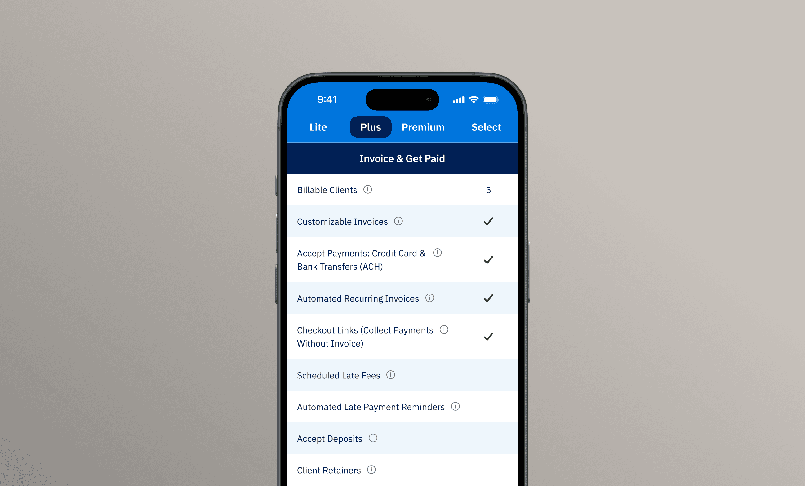
Final Designs
The redesigned pricing page brought clarity, structure, and visual alignment with the updated FreshBooks brand. We introduced a clean, grid-based layout using our global design system to create consistency and improve scannability.
One of the biggest wins was securing stakeholder buy-in to shorten and simplify the pricing table copy—without changing the core plan content. This allowed us to reduce cognitive overload and make it easier for users to compare features at a glance.
We also removed lifestyle imagery from the hero, replacing it with a more focused design that kept attention on the offer and pricing. Clearer call-to-actions and a more digestible layout helped guide users toward the right plan with confidence.
The result: a more accessible and conversion-friendly experience that drove a
10% increase in signups
20% boost in leads to sales
Positive feedback from stakeholders and users citing improved clarity
Yearly Promo Discovery
To surface the promotional offer tied to the yearly billing option, I designed a subtle animated bubble that highlights the Yearly toggle on page load. Rather than introducing new banners or disruptive UI elements, this approach gently guides the user’s attention to the offer that’s otherwise hidden within the yearly pricing content.
The animation was intentionally light and non-intrusive—just enough movement to catch the eye without distracting from the rest of the page. This solution struck a balance between discoverability and user experience, ensuring the promotion was noticed without overwhelming the interface or detracting from the core goal: helping users confidently choose the right plan.


Reflecting Back
This project demonstrated the power of design to drive both brand expression and business outcomes — even under heavy constraints. Working across teams, I helped simplify a complex decision-making experience and contributed meaningfully to FreshBooks’ growth goals.


